


We released a small update late last week. It’s a follow-up to our last release of 2019, and like its predecessor, this release, 2.1.2, aims to improve the general stability of nRF Connect for iOS as well as take care of some of those loopholes we rushed through the production of our big 2.0 release. For example, in 2.1.2, you can now finally set the number of BLE packets received before a Package Request Notification (PRN) is sent back as part of the DFU process.
With 2.1.2 out of the way, work has now undergone on our next major feature-release, nRF Connect for iOS 2.2. We can’t get into details yet about what 2.2 will bring to the table, but we think it’ll be the last release in which you’ll be missing some features of the old 1.x version.
That being said, we want to try and pivot our blogging strategy a bit. Instead of speaking about features, we’d like to talk a bit about implementation details, and give back to the fantastic iOS and Swift Developer Community that’s constantly sharing their learnings.
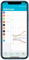
Case in point: the RSSI Graph Tab in nRF Connect for iOS.
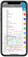 |
 |
nRF Connect for iOS 1.x (left) and nRF Connect for iOS 2.0 (right)
As we were working on the full rewrite of nRF Connect 2.0, our goal was not only to achieve feature-parity, but also to deliver a better product in every way possible. When it came to the RSSI Graph Chart, the product we ended up shipping in 2.0 not only looked better, but, was a lot more readable, responsive and provided a much better smoothing algorithm. In other words: the lines that we drew, made a lot more sense, as you can gather from the screenshots above.
This might appear simple to do: after all, can’t you just calculate the weighted average of all Advertising Packets when you need to draw them on-screen? How hard can that be?
Well, it was a lot harder than we thought. For example: you can’t just do a weighted-average and blame the graph on the math. Because the real use case of the RSSI Graph is not just to look at colored lines, but to find which device is closest to you, and to visually gauge whether its power levels match your expectations. Say, for example, that you’re working on a new device, and you want to test how various plastic materials affect the signal strength of your end-product. Or, you’re closer to production and you want to check the signal strength across a room.
Okay, you say. Leave simple weighted averages out. Just draw a point for every Advertising Packet received. We’re sorry, but that won’t do it – that's how nRF Connect for iOS 1.x did it. If a device advertises 10 times per second (100 ms), and you scan for only a minute, that’s 600 dots drawn on the chart for a single device. Try to use this algorithm at Nordic Semiconductor’s HQ or at a shopping mall. It’s so slow that if you’re not careful, iOS’s watchdog will kick you out into SpringBoard. We want to do better.
Warning: There’s a lot of code in this blog post. Its purpose is not for you to understand each line, just the general ideas we used to solve each problem. This way, if you stick to our ideas and you encounter similar issues, you can write your own implementation rather than have to remember exactly how we did it.
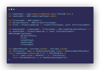
nRF Connect for iOS 2.0’s Solution
This is the algorithm we came up with for our initial release of nRF Connect for iOS 2.0:
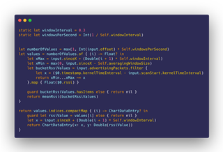
In English: we’ve decided to split every second into three buckets (windowInterval and windowsPerSecond constants), so for every second, there are only three points in the RSSI Graph Chart. Given this, we decide the numberOfValues we’re going to add into the chart, and then proceed to calculate the average RSSI value we want to give each one. For this, we’ve borrowed a book out of the TCP Windowing Algorithm, and defined a 4-second window size(Self.averagingWindowSize constant), which is the span of advertising packets before our current value that we’re willing to average-out against. Once we’ve found all the corresponding RSSI values for our current ‘bucket’, we calculate the mean of all those Advertising Packets, and that’s the y-value for our current x in the RSSI Graph.
For the most part, this works reasonably well on modern hardware, such as the iPhone XR, where we can have a set of 20 devices advertising and still draw the RSSI Graph in real-time at 60fps at a decent speed. However.
There’s this one tiny. Big. Problem that we noticed.
| Time to Draw RSSI Graph | Immediately after Scan Start | After Scanning for 30 s | After Scanning for 120 s |
| nRF Connect 2.0 (Baseline) - iPhone XR | 45.59 ms | 547.5 ms | 7.11 s |
Yikes! Talk about incurring the wrath of iOS’ watchdog!
So, er, we’re a bit embarrassed to admit that until 2.1.1, this was the situation at hand. If you dared switch to the Graph Tab mid-scan, and there were a lot of devices seeking for your attention, it got slow. Too slow. But why?
To get these numbers, which are representative of the algorithm being used and not the exact code, we used some of Apple’s newest tools: Time Profiler Instrument as well as the OSLog Signpost APIs. Although it’s easy to see where your program is spending most of its time with Instruments using the Time Profiler, with signposts you can zero-in and even, using parameters, obtain guidance data as to whether one particular use-case of your code is causing trouble, rather than the full function call.
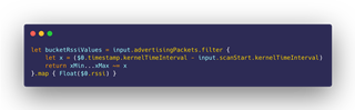
Time Profiler in-hand, even before the release of nRF Connect 2.0, we zeroed-in on the culprit, which is the closure gathering all the Advertising Packets we’re going to calculate the mean of for each point drawn in the graph:
Why didn’t you fix it then, if you knew the culprit before 2.0 was released?
It wasn’t easy. The code above represents the end-results of hours, days and weeks of work, slowly tweaking a line here, a line there, a plus sign here, an offset over there, to get us the Graph to draw exactly as we wanted it to. And our baseline algorithm, though slow, expressed exactly the data we wished to see on-screen: smoothening all the Advertising Packets in our input, on a per-window basis.
We had an inkling as to what our possible solution could be, but we needed research and time to “waste” without being sure whether our ideas would prove successful. Which is exactly what we got just before the Christmas break, and that was 2.1.1.
SIMD to the Rescue
Anybody remember when Intel came out with the new Pentium MMX chip? No? Intel got blamed for making MMX a marketing scheme to sell more chips, but the reality was that it was the cornerstone that brought SIMD instructions into the Personal Computer era. Let us explain this a bit better.
Source: Wikipedia
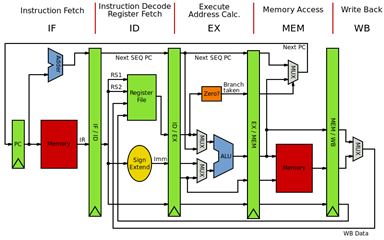
Don't worry if the diagram above is too complicated – just follow the stage names at the top.
When our Swift code is broken down into x86 or ARM assembly instructions, it is fed into one of the processing cores of our device. To make sense of these instructions, the way CPUs work (at a very high level) is that they split the work into different stages, called pipeline, which we’re going to summarize as Fetch, Decode, Execute and Retire (Memory Access + Write Back), as seen above. There’s an excellent writeup here and a good YouTube video here if you’d like to know more.
Why do we, as programmers, need to know what a CPU pipeline is? The pipeline is essential to understanding the bottlenecks of our code. You see, our code is stuck in that filtering loop; to be exact, the line that Instrument flags is the subtraction between the two time intervals to obtain the ‘x’ position for each Advertising Packet. That operation is performed inside the Execution stage of our device’s CPU, and Time Profiler complains that we’re repeating the same operation about 6194 times.
If the operation is correct, and the algorithm is correct, but it’s too slow, what options do we have? For one, we could make better use of our existing hardware. And that’s where SIMD comes in.
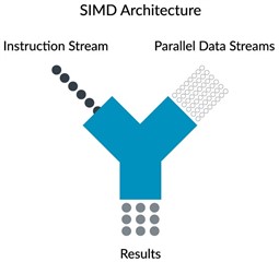
Source: ARM Developer Website.
SIMD stands for Single Instruction Multiple Data, and the first mainstream addition of SIMD instructions into the x86 family of processors happened in the Pentium MMX. SIMD allows a CPU to iterate faster over a series of operations by grouping them together into one single instruction; for example, if we have an array of numbers, and we need to add or subtract the same number from all of them, rather than pipeline an instruction for each element within the array, we can issue multiple SIMD instructions, each targeting an independent segment of the array, providing us with a 2x, 4x or 8x throughput improvement, “for free”. There are many catches to this; for example, SIMD instructions have a limit to the number of operations they can group together in order to obtain full hardware-speed, and this is related to each chip’s design and underlying architecture. We are skipping over many details here, but the important part is that you understand why there can be real advantages to making better use of our existing hardware. If you can find the video for it, Apple’s WWDC 2010 The Accelerate Framework for iPhone OS session illustrates the advantages of using ARM’s NEON (SIMD) instructions very well.
As we said before, the Pentium MMX was treated a bit as a fad by history. A part of it, and this will sound familiar, was because to make use of the speed enabled by the new instructions, developers had to write code that used them. Finally, these first Pentium MMX processors did not have a separate hardware pipeline for SIMD instructions, so if you used the new MMX instructions, you caused a bottleneck. This was later addressed with the SSE and 3D Now! Instruction Sets introduced by both Intel and AMD, allowing parallel execution of SIMD instructions, for both Integer and Floating-Point operations. Since then modern hardware in our industry, like what runs in contemporary iOS devices, is expected to have independent pipelines for both standard and SIMD instructions.
This is irrelevant; the compiler already optimizes my code

Yes, it does. But as we just explained, SIMD instructions operate independently of your standard CPU core pipeline, and, use their own set of instructions. This is both true for x86 family of processors as it is for the ARM family of processors. If you want to make use of the hidden power of the SIMD instructions that are already part of your old iPhone 6s or SE, you have to do it yourself.
Is it worth it? We think it is. Gone are the days when, as software programmers, all we had to do was to write code, and blame it on the user’s slow processor for the performance of our software. Yes, Intel founder Gordon Moore’s Law is Dead, and it has been for quite some time. Despite all the hoopla around the 10 Ghz processor in the early 2000s, the Pentium 4 architecture and its AMD counterpart crashed and burned by the laws of physics. The solution to this problem, instead, has been to use the extra space provided by better manufacturing processes to give us more cores, or (semi-)independent execution units. That too has a problem: multi-threaded code is hard. But the message remains: to extract better performance, the solution is to run our software in specialized hardware. Not only is it faster, but it is also more power efficient, which has a plethora of positive side-effects that are almost endless, like less heat is produced in the device, less battery consumption, etc.
But that’s not why we’re here.
Using the Accelerate framework in iOS
Accelerate is the all-in-one framework to make the best possible use of all the vector processing capabilities of Apple’s devices, be it on ARM-based systems (iOS and derivatives) or on x86-based systems (Mac?). The concept behind this framework is that it gives us access to optimized implementations of math algorithms that are hardware-accelerated, at the cost of a more complex API. This allows us to write complex algorithms once, tapping into the full power of the silicon underneath, without needing to know about the architectural differences between Apple SoC generations, or even using x86-specific if the same code is running on a Mac. We trust Apple at their word, but yes, we’ll admit that we’ve heard this somewhere before.
So if our goal is to speed-up our graph computations, the Accelerate framework is where we need to look.
Unfortunately for us, there’s very little practical information regarding the use of Accelerate functions in real life. There are many WWDC talks given by Apple on the topic, and although some examples are valid, most of them don’t apply to the standard arithmetic uses we need. And if you go on looking for Accelerate examples on the web, 99.9% of them are just rehashed examples from the documentation. No practical use-case guide for where you can use Accelerate, except if your use case follows what is described in the documentation. If you have an algorithm written in Swift with a processor-intensive loop that you’d like to speed-up, there’s no writeup with a guide as to how you might go about it or the corresponding performance numbers to back up the theory. Seemingly no one has tried this, or we’re very wrong in our approach regarding Accelerate. Which is one of the reasons why we thought this blog post might make sense for other Swift developers.

Our search for the Holy Grail Accelerate function began in the simd reference within Apple’s Documentation. The Working with Vectors Section looked promising from its title; after all, we had vector-arrays full of integer RSSI data needing to be processed. But instead, vectors here refer to their mathematical counterpart, as in vectors in space, and not in vectors as arrays of data to be processed using SIMD instructions. Dead end.
What now? Judging by their names, we were sure no other library within Accelerate could fulfill our needs, so we needed another strategy. Maybe we needed to think differently. So we put in Google the first thing that came to mind “Graph Averaging Algorithm”. We don’t remember exactly what we read, except a lot of Wikipedia regarding Fast-Fourier Transfers, Convolutions and more, but two bullet-points came out of it when we got tired or reading:
- We were way in over our heads – why wasn’t this a whole lot easier to do?
- Our (X,Y) data of RSSI values over time could be thought of as Signal. To us it didn’t look like it – the graph is just a representation of the Advertising Packets received over time. But algorithmically, we could feed our data as a signal input. Therefore, maybe the vDSP library in Accelerate held the key.
The direct consequence of this is that we started reading about Digital Signal Processing. We had zero confidence in Apple providing good documentation for its vDSP library. And when we got tired of looking more into signal theory and math, we just asked ourselves a question: how do you use Accelerate for the simple stuff? Like maybe, what if we just used Accelerate to calculate the average of a subset of RSSI values?
Quick Google search, and we found it. Then by clicking around, we stumbled into the main vDSP Documentation Article, and discovered it was a lot richer than its simd counterpart. Right from the get-go, there’s a lot more text and images to go along, providing a visual representation for at least the one listed sample function. The document was also very big, and looked properly categorized, so we started digging in. And we found something that looked like our code hotspot: windowing algorithms. The issue, however, is that once again, there was no documentation. Quick Google Search with the name of the library function call revealed a hit on GitHub with swift as its root name. We checked it out, and it turned out to be the Test Suite for the Accelerate framework itself. Good enough. The same strategy could be applied to other function calls to get an inkling as to how these vDSP functions needed to be fed from Swift/UIKit.
Quick Aside: What are these vDSP Functions and why are they in Accelerate?
As its name suggests, vDSP stands for vector Digital Signal Processing, where vector is a stand-in for SIMD-like operations that can be performed all at once. The conceptual roots of this library lie in the fact that SIMD operations can be used not only to fast-track processing of arithmetic data, but also to apply algorithms to waveforms, such as those used in processing digital audio. This is the reason why ‘MMX’ was sold as multimedia-enhancing capabilities for those early Pentium processors. And because we initially dismissed our dataset as being DSP-friendly in any way, we did not dare to look here. All we were expecting to find were algorithms to apply Fast-Fourier Transfers and so on. But the reality is that vDSP contains a lot of very usable functions that you should not dismiss.
The more complicated, and more technical answer to this question relies on the fact that CPUs took their learnings from the SIMD speed-ups and began adding tiny dedicated processors within themselves, sometimes referred to as ‘blocks’ (IP blocks, SiP blocks). For example, there is an AES-specific instruction set implemented by multiple families of processors designed to speed-up encryption and decryption of cryptographic algorithms such as AES. Whilst true that these algorithms can be executed in the main Integer/Floating Point pipeline, using dedicated hardware trades computing flexibility in exchange for lower-power and greater-performance. Thus, since these units tend to be small and dedicated to targeted tasks, modern microprocessors incorporate many of them, and switch between them depending on the instructions received.
This is why multiple libraries such as Machine Learning and vDSP find their home in Accelerate; Intel (x86) chips are well documented at this point, but Apple’s custom SoC architectures aren’t, so we don’t know for certain what kinds of specific hardware blocks are on those chips or how they work. What we do know, however, is that by using Accelerate, we get to enjoy the rewards of using the most efficient hardware for our supported tasks, “for free”.
Note: Accelerate doesn't tap into the hidden powers of the GPU. That's what Metal is for.
Accelerate Results
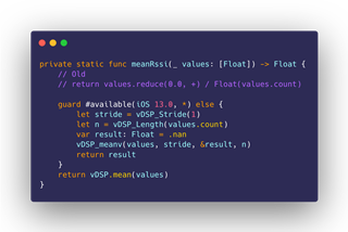
We probably spent almost a full day of work trying to get the vDSP.slidingWindowSum() to work. It not only needed to build, execute and produce a result, which required changes to our existing code translating RSSI values and mapping them to their X-axis (time) counterparts. But it also had to deliver the expected visual representation for our signals: what if a device comes online half-way through the Scan? Or if a device stops advertising and then comes back? The RSSI Graph tool is expected to be a visual representation of the strength of the BLE signal received, and these details, we learned the hard way, are not covered by a blunt sliding window algorithm. We were not ready for this kind of investment – it required a lot of backup logic to drive the function towards our desired direction. Worse still – the added logic that we were having to add looked similar to the logic we already had in our baseline algorithm. Translation: we did not measure it, but when we returned to our baseline algorithm it seemed a lot faster. Not a good indicator of things to come.
At one point, fidgeting with vDSP’s sliding window functions, we lost all sense of direction, so we decided to simplify our goals. Maybe we needed a different perspective to unlock our problems, just like coming back to the Accelerate documentation with another train of thought brought us a couple of steps closer to our goal. Leave the sliding window hotspot. Let’s at least try to use Accelerate for something simple, like calculating the average of all the received Advertising Packets that fit into a single window. We had this tab open in our browser, with some great documentation to go along with it. All we had to do was modify our mean function to use Accelerate.
| Time to Draw RSSI Graph | Immediately after Scan Start | After Scanning for 30 s | After Scanning for 120 s |
| Baseline - iPhone XR | 45.59 ms | 547.5 ms | 7.11 s |
| Baseline + vDSP Mean - iPhone XR |
6.30 ms |
421.62 ms |
6.22 s |
Wait.
What?
That’s it?
Those are not the numbers we were expecting. Those numbers don’t fix anything for us. In fact, if that’s all we get for importing a framework and adding more lines of code, we’re better off leaving the code as it was before!
Taking a Step Back
Although barely noticeable, this data doesn’t suggest Accelerate didn’t provide us with any benefits. In fact, these numbers are quite different than the ones we got when we first began trial-testing Accelerate, where the use of the mean function gave us slower numbers. We’re not joking.
Whatever the case, these numbers speak the truth: we did not fix our problem, which was the hotspot that Instruments underlined in red colors for us.
Instead, we were too focused on using Accelerate. CPU Architecture is fascinating. Learning new things is intoxicating. Seeing how time flashes by during your workday feels invigorating, and at the same time, disappointing. Disappointing because we’ve got absolutely nothing to show for our efforts and what we’ve learned.
So Accelerate is not the answer for us. It does not fix our slow RSSI Graph Algorithm.
In parallel, while we were shoe-horning vDSP functions into our existing code, we came up with a simple idea: if our current baseline algorithm, while correct, takes too much time, maybe we’re doing too much. One way to speed up the number of instructions you need to execute, is to execute less instructions! This insight provided us with the seed for our new solution: just ditch the slow part of our algorithm, the windowing part, and clump together as much data as we can into one or two points in the graph per second. This means that for every second, for every device, we’re just drawing two points. And instead of potentially iterating multiple times over the same array of Advertising Packets to ensure accuracy, we do it just one time.
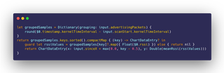
We were afraid of how fast the grouping initializer for Dictionary could be. In big O terms, we believed this should be faster, but again, we were afraid reality could come back to bite us. Perhaps there was some hidden complexity in our code that we weren’t aware of. But once we ran our benchmark, we forgot our doubts:
| Time to Draw RSSI Graph | Immediately after Scan Start | After Scanning for 30 s | After Scanning for 120 s |
| Baseline - iPhone XR | 45.59 ms | 547.5 ms | 7.11 s |
| Baseline + vDSP Mean - iPhone XR |
6.30 ms |
421.62 ms |
6.22 s |
| Fast Algorithm - iPhone XR |
7.22 ms |
19.43 ms |
43.59 ms |
This new ‘Fast’ algorithm as we’ve called it, is not perfect. It’s very fast, yes, but because it discards so much data and averages so much out of it, it loses detail when used to draw incoming Advertising Packets. In other words: it’s very good for drawing data that has already been scanned, but it’s not very interactive. So, our solution since nRF Connect 2.1.1 has been to use the ‘Fast’ algorithm for the initial drawing, and then reverting to our baseline algorithm for interactive use. The best of both worlds: Speed and Accuracy.
Conclusions
The time we spent learning about Accelerate, SIMD and vDSP was not lost. For one, it allowed us to write all of that knowledge into this blog post, which the team can revisit whenever we feel like exploring new ideas in this area. But also, despite all the time that we spent chasing the power of vector instructions and fact-checking our PC history memory banks, we feel a lot more comfortable now with the vDSP library in general.
In fact, during the writeup process of this blog post, we went ahead and found a function in the vDSP library that looked like it was made just for us. It is extremely well explained, and the visual aids made us confident that it’d be easy to write, and that we would be able to conclude this writeup with a happy Hollywood ending.
But no. The function works, and it draws good-looking RSSI curves, but we encountered a couple of problems; the Y-values (RSSI) were inverted along the X-axis, and try as we might, we could not invert them back easily. But this paled in comparison to the fact that the resampling algorithm was extending the signal value when a device was not advertising. So, for example, if a device is discovered mid-scan, with this vDSP algorithm it’ll appear as if it had advertised all the time, which is not the case with our Baseline and Fast algorithms.
It’s likely both of these issues come from our inexperience with this API, and that more time is needed for it to work properly. But for now, the main goal of this exercise was to speed-up the RSSI Graph when switching to it after scanning for a long time, and we addressed that issue. That’s the only thing that users care for, in the end.
That being said, we cannot let it go. We work at a semiconductor company, and we are very passionate about CPU Architecture, so this idea of using lower-level APIs to make better use of our powerful devices is still stuck in the back of our skulls, like a splinter in our minds. We’ll keep trying and learning.
Until then, let us know in the comments if you prefer this low-level style about the technical innards of nRF Connect, rather than our usual product debriefings. See you next time!

Top Comments