

For the past ten months, we’ve been busy, hunkering down in front of our keyboards, keeping the blinds down, shooting mean looks at our bosses whenever they dared interrupt us. And of course, all the while, we were blasting some Linkin Park through our Beats headphones, making sure our energy levels were kept flying high. We needed it. Because every single time a new email hit our inbox, we felt the pain of having to ignore one of your many requests, that went along the lines of:
- I’m missing [INSERT FAVOURITE FEATURE] from the Android app in iOS.
- The current version of nRF Connect is good, but could you please fix [INSERT BUG]?
- Help? The app is crashing for me!
It wasn’t easy for us. We didn’t intend to ignore you, or disrespect you. All we knew was that we were working on something new, which we hoped would turn out to be really great. After all, we deemed it unnecessary to just promise that a brand-new version of nRF Connect was coming, without being able to commit to a release date. In other words: we didn’t want to be just another case of vaporware.
We did that in the hopes that one day, we could proudly announce that it was ready: that all of our hard work, together with your continuous support and use of nRF Connect for iOS, had yielded a fantastic new Bluetooth Low Energy tool for you to use. And that day, just so happens to be today. Right now. So please, stop reading and go get it from the App Store!
But if you want to keep reading to discover what’s new, be our guest :)
Learning From the Past
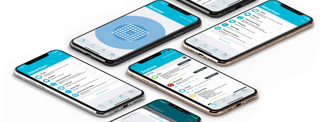
nRF Connect for iOS 2.0 had two main influences behind its design. The first and most evident one, was its predecessor, nRF Connect 1.x. This is the app you know and love, and have depended upon time, and time again, to scan and work with your nearby Bluetooth LE peripherals. As such, making a brand-new app had to both seem familiar with our existing users, as well as make noticeable improvements upon it that made it easier, and not harder, to use. Whether it’s written in Smalltalk, Objective-C, Swift 5.1, uses nibs, Storyboards, or SwiftUI, is of little importance to you: all is rendered useless if you can’t feel that the app works and makes your life better with it in your device.
 |
 |
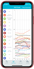
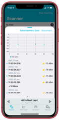
nRF Connect for iOS 1.8.8
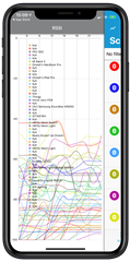
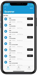
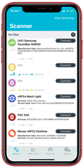
Out of the box, our first change was focused on navigation and discoverability. Although there is a button on the top-left corner to access the RSSI Graphs in nRF Connect 1.x, we felt this had two major drawbacks:
- Phones are getting noticeably bigger, so we should strive to remove as many parts of the User Interface from the topmost sections of the app as possible.
- The swipe-right to open behavior did not seem discoverable enough to us. This is a concern we took from nRF Connect for Android too, where we’re currently lacking any visual indication of the existence of these graphs, unless the app is running in tablet form.
 |
 |
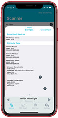
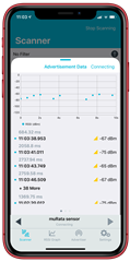
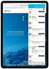
NEW! nRF Connect for iOS 2.0
This pushed us to improve upon both of these situations. And the end result is that we pay an homage to how nRF Connect used to work, but, making it a lot more discoverable. To the point that it’s now impossible not to know that there’s an RSSI Graph view in the app. Granted, you cannot swipe anymore to switch between the Scanner List and RSSI Graph, but it’s a lot easier now to move between them because they’re independent, though related, tabs. And, because we keep a shorthand version of the Scanner list on the left side of the RSSI Graph screen, you don’t lose track of the items you’re watching over. This plays very well with how both key screens are positioned within the app’s navigation: because the items are on the left, it can feel like the Scanner list, which is the leftmost tab, is “breaking into” our RSSI screen, which sits to its right. Neat, if you ask us.
Of course, that is not all. If you were a power user of nRF Connect’s 1.x, you’ll immediately be surprised by 2.0’s improved performance regarding the drawing algorithm for RSSI Graphs, no matter the age of your device. This is achieved through a combination of background threads (via Grand Central Dispatch), a windowing algorithm to average-out the broadcast interval of the scanned devices, inspired by the TCP protocol, and the use of the Core Animation Display Link API. A CADisplayLink works like a Timer that’s synchronised with the refresh rate of your device’s display, meaning you’ll get called at the appropriate time for your users to see your updates, without clogging your CPU too much. Because CADisplayLink was designed to keep the device’s frame-rate smooth at all times, prioritising user interactions, you’ll see that the graph stops updating the moment you interact with the app, such as when scrolling through the list of devices. It’s a minor inconvenience for sure, but we think the benefits outweigh the drawbacks.
Learning From the Best
 |
 |
 |
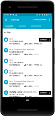
(Latest) nRF Connect for Android 4.22.3
Improving upon what your predecessor has done is alright and well. But one must also look towards the source of inspiration for most Bluetooth LE Scanner apps. And in this area, we believe our sister app, nRF Connect for Android, is the benchmark. Not only in terms of speed, reliability, and huge set of features, but also in terms of design. And like with our iOS predecessor, we vowed to improve upon the aspects that we thought we could do better, to keep nRF Connect for iOS, an authentic iOS experience. We did not want it to feel like an Android app running on your beautiful iPhone.
The first order of business is that we entirely dismissed the idea of using a Navigation-Drawer pattern, also known as the “hamburger” pattern. To put it simply, we think the Navigation Drawer is an example of lazy design: rather than think about where to put things and make the overall structure of the app feel cohesive for the user, it lends itself very well to just throwing disconnected pieces of functionality in the app into said drawer. It’s the equivalent of that room in your house where you throw everything that you don’t want to see, but that someday, you think you might need. This is not something we wanted to burden our iOS users with. Because Apple’s own iOS apps set the standard for what users expect to find when they download nRF Connect into their iPhone. And Apple doesn’t use the Navigation Drawer, so we didn’t want to, either.
The second aspect we thought we could do better is the way nRF Connect for Android opens tabs for devices you want to learn more from. Whether it’s checking out their advertised services, or to connect to them and discover more information, we didn’t like the fact that if you opened a device, you got sent to a faraway tab hard to recover from, because the Scanner and Advertiser features were now thrown in on the far left side of your tab switcher. This situation worsens the more devices you keep open, and because most devices don’t advertise a name, it becomes a painful experience to keep track of what devices you are looking at.
 |
 |
 |
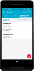
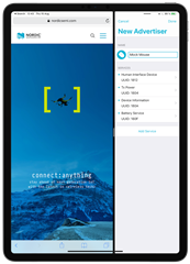
(NEW!) nRF Connect for iOS 2.0
These are the issues we tried to address when building nRF Connect 2.0, which shuffles a lot of navigation functions to the bottom half of the device, where they are the easiest for you to access with your thumb, within the aptly named Thumb Zone.
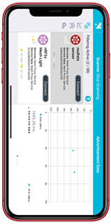
The first part of new Interface that pops up wants you select or tap on a device, is what we initially called the “Player” view, since it was inspired by Spotify’s Music Player UI, and later as the “Device Switcher” view. The latter explains exactly what this bar sitting immediately above your Tab Bar does: it enables fast-switching between all the devices you’re interested in, like all of your connected devices, or the devices you’ve selected. If the “back” and “next” buttons are greyed-out, you can’t switch between any other device. But if they’re enabled, you can quickly compare advertising data or services between them, without having to wonder where each device is and where you need to move your thumb around, too. It’s a very useful feature if you need to connect to multiple devices.
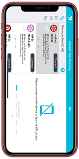
The last part is of course, the Device Details view, which allows you to switch, again horizontally, between three different panes: Advertisement Data, Services & Characteristics, and Device Firmware Update. Again, we’ve used a common idiom known to iOS users, which are the three dots at the bottom of the pane, to signal users that they may swipe to discover more functionalities. And in particular, we’re very happy about how, once connected, users can quickly see at once all of the Service functionalities offered by a device. In both our Android counterpart, and in the previous version of nRF Connect, users had to tap on each Bluetooth LE Service to discover what Characteristics they might offer. This is no longer the case with 2.0: all you have to do, is scroll.
iPad Experience Upgrade
The team working on nRF Connect at Nordic is a huge fan of the iPad. We were awestruck since Steve Jobs presented it at the Yerba Buena Center for the Performing Arts, located in the heart of San Francisco, sitting in a sofa to browse the web in front of an entire auditorium full of press and VIPs gazing at him. So, we wanted to do something special for it. We couldn’t live with ourselves just enabling a checkbox in Xcode and having our iPhone-designed screens blown-up to the size of our 11-inch iPad Pro. If we supported it, we wanted to do it right. And since we were obliged to do so, because the previous version of nRF Connect did, and Apple doesn't allow us to stop supporting the iPad without losing our existing entry into the App Store, we went all-in on it.
 |
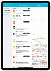 |
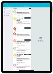
(NEW!) nRF Connect 2.0 running on an 11-inch iPad Pro (2018)
The end-result is a stunning three-pane layout that makes use of the entire real estate offered by the iPad. And getting here, wasn’t easy. There were many challenges, and many questions that needed answers.
First of all, what does an iPad app look like? When the moment to design our iPad version of the app came, we were utterly lost. So many hours had been spent in the design and details of what the iPhone app should look like, and work like, that we lost complete track about the fact that an iPad has a completely different set of requirements: there’s lots of space, and therefore the content needs space to breathe in it. But how could we make this switch? We needed a North Star, a product to look up to, something that fit into the iPad, and the iPhone, as well as we aspired to.
Our bucket of inspiration came following Apple Design Award-winner app Agenda, an app that combines note-taking abilities with the time-tracking capabilities of a calendar. And it does so with a beautiful design that we believed, combined the basic principles of what Apple was doing, such as the three-pane layout used by Mail in iPadOS, as well as being true to itself with its design. However, Agenda had an ace up its sleeve: its iPhone app is designed as a vertically-restricted window into the layout of its iPad app. Let me explain; the fine folks at Momenta B.V. designed their app the other way around: iPad first, split into three panes. And then, the iPhone app works as a window into the central pane, with the left and right panes sliding in when necessary, keeping navigational awareness intact across both devices. This was not something that worked for us: our product was split into multiple sections that intertwined together in some way or another, with more options coming in the future. We couldn’t place the Settings UIViewController on the right side of the screen and make it slide-in: it doesn’t make sense for what we wanted. So how do we fix this?
 |
 |
 |
Apologies for forcing your neck to twist - our CMS didn't like these horizontal screenshots :(
Sometimes the answer doesn’t come in the form of a perfect solution, but that of a change in perspective; a new way of thinking. Inspired by this, we looked at how Agenda was conceived, through this amazing talk by one of its founders, Alexander Griekspoor. And this allowed us to arrive at our one, key, insight: our layout worked very well for the iPhone, so nothing had to be changed there. But what made Agenda look so good in the iPad? The answer is simple: iPad apps look good when their content is distributed horizontally, whereas iPhone apps look good when they’re distributed vertically. Getting there wasn’t possible with the standard iOS Tab Bar, because we also wanted to support Plus-sized phones, such as the new iPhone XR, which we expect will become the most popular line of iOS devices in the years to come. So, we couldn’t just lock the app into behaving one way if it was running in an iPhone, and in another way if it was running on an iPad, and call it a day. That was not an option.
So, we had to do it the hard way: we made our own custom Tab Bar controller, that was aware of UITraitCollection changes, allowing it to quickly adapt between portrait and landscape orientations. Furthermore, iOS apps live under the presumption, from the user’s perspective, that they’re not complicated: they should always behave as one expects them to, because they’re “apps”. They’re toys. Not software that is allowed to fail, like their desktop counterparts. So, upon rotating back to portrait, we had to ensure the app looked as if it had been started in portrait orientation, complete with its custom Device Details panel animation, darkening and rounding effects. A complete transformation of the user interface, and yet it all works. And if you find a bug, please let us know about it.
 |
 |
Left: Slide-Over functionality. Right: Safari & nRF Connect 2.0 for iOS Multi-tasking.
The added benefit? Because the app is ready to switch whenever necessary between its portrait and landscape designs, it can react seamlessly to size changes in the iPad! Meaning whether you’re using it in slide-over, or in landscape with two-thirds of the screen available, and then you switch to portrait, the app will adapt and make the best use of whatever space is available. Just as a North Star iPad app is expected to do.
Before we leave, there’s One More Thing, regarding the iPad: remember how we mentioned the use of the CADisplayLink API earlier? Well, it turns out that new iPads are equipped with variable refresh rates screen technology, which Apple just calls ProMotion. What this means, is that the refresh rate of iPad screens is not fixed at 60 times per second like in the current staple of iPhones, but that it can adapt to the content and switch between 24, 48 and 120 Hz. By using CADisplayLink, we’ve insured ourselves not only into the amazing work Apple is doing in terms of hardware on the iPad, but also, for when this technology arrives to the rest of the Apple ecosystem.
That's Enough... for Now
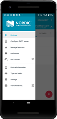
We haven’t even scratched the surface of all the new things we put into nRF Connect 2.0, like the Device Firmware Update Animations, our support for iOS’ new Document Picker, allowing you to select a ZIP file to perform either from your own device, or from a different service such as Dropbox. Or how filters work, and our Advertising functionalities. Not to mention the internal architecture of the app, which we believe could be interesting to look at, since it’s partially responsible for the way it can quickly adapt its UI to any changes the user might request of it.
But we think you’ve heard enough from us for today. Gotta go and prepare for the next update, don’t we?
See you soon!
Top Comments
-

Geir Strand
-
Cancel
-
Vote Up
0
Vote Down
-
-
Sign in to reply
-
More
-
Cancel
-

Dinesh Harjani
in reply to Geir Strand
-
Cancel
-
Vote Up
0
Vote Down
-
-
Sign in to reply
-
More
-
Cancel
-

Geir Strand
in reply to Dinesh Harjani
-
Cancel
-
Vote Up
0
Vote Down
-
-
Sign in to reply
-
More
-
Cancel
-

Dinesh Harjani
in reply to Geir Strand
-
Cancel
-
Vote Up
0
Vote Down
-
-
Sign in to reply
-
More
-
Cancel
-

Aleksander Nowakowski
in reply to Dinesh Harjani
-
Cancel
-
Vote Up
0
Vote Down
-
-
Sign in to reply
-
More
-
Cancel
Comment-

Aleksander Nowakowski
in reply to Dinesh Harjani
-
Cancel
-
Vote Up
0
Vote Down
-
-
Sign in to reply
-
More
-
Cancel
Children