Preface
The bulk of the development work described in this blog post occurred during the 2021 calendar year. This means it reflects the state of iOS, Mac, Swift, and SwiftUI Development before and after the transition from the iOS 14 "family" of releases and iOS 15, months before this summer's WWDC 2022. There will be some comments throughout the text referencing these new additions, but for the most part, we will address Apple's iOS 16-era changes towards the end.
Intro
Nordic's Mobile Applications Group is a tight-knit bunch. We're split almost evenly between iOS and Android developers, and we have the pleasure (and privilege!) of almost always working on our own codebases. There are some libraries we maintain over at GitHub, and when the time comes, the person who last committed to it will usually cover any new feature or issue that springs up. However, there is no red tape in this team regarding whose code or library, a project is. If help is needed or if something needs to be done, and the 'designated person' is busy and can't take over the task, it is handed over as needed without any trace of ego.
This sets the stage for early 2021, when we were all comfortable working on our own little projects. Then, preparations for the newest member of the Thingy family, powered by our new nRF53 chip, began. And as has been the case in the past, proposals were made to build a new sample app to showcase the capabilities of our new Nordic product. A collaboration with Edge Impulse arises, and the idea to develop an app in which reliance on an Internet connection is foundational rather than additive, contrary to what we're used to doing, takes form. And to add even more spice to the mix, we decide as a team, on both sides of the camp, to embrace the newest set of technologies: Kotlin, Jetpack Compose and the new Architecture Components for our green droid friends, and Combine + SwiftUI for ourselves on the Apple side. To boot, all Android and iOS developers would work together on each respective platform's app for the first time - though that would change fast as the scope of the overall project grew and more apps were required. But to start with, these were exciting times!
Context: nRF Connect for iOS on the Mac, and our pre-SwiftUI Catalyst Experiences
Flashback to Christmas of 2017. We were all busy after the launch of the new iPhone X, due to the changes it required to the UI norms we were so used to with previous iPhones and their Home buttons. Then, when we least expected it, jaw-dropping news dropped in the form of a blog post by Mark Gurman: Apple was bringing the iOS framework over to the Mac. At first glance, this might not make sense. Until it does: most of the effort on Apple platforms from 3rd-party developers goes to iOS first, iPadOS second, and, Mac last. Relegated by its older APIs, before this announcement making a Mac App to complement an existing iOS counterpart required painstaking effort on the part of the developer due to their incompatible UI systems. The most reasonable solution was a 'three target' project setup: one for the shared logic, one for the iOS/iPadOS app(s), and then the macOS app. But this news, allowing iOS apps to run on the Mac without having to start a project from scratch, was the equivalent of Apple allowing us to lift our existing iOS codebases from iPhone-town, drive it over to Mac-town, and drop it down on a compatible set of foundations. No need to break our existing house apart, move the contents of the rooms into a warehouse, set two façades on different neighborhoods, and then fill the insides of those façades with components built from the warehouse.
The planned feature was revealed to be true at the next WWDC, in 2018. And in 2019, the effort received an official name in the form of Project Catalyst, marking the start of a race for iOS apps to come to the Mac. "Just check the Mac checkbox" was their motto for it. But amongst the announced features of 2019, a new framework caught the developer community by surprise: a new declarative framework by the name of SwiftUI, together with an independent, but very SwiftUI-friendly and reactive framework called Combine.
This level of confusion regarding which method to pursue for new projects stands to this day (that includes WWDC 2022, but more on that later). Out of nowhere, there were now three ways to support Apple platforms from a 'single logic' codebase: you could either keep a shared logic target and then spawn two independent UIKit (iOS) and AppKit (macOS) targets from the same workspace, as was previously the case. Or, you could use the new Project Catalyst checkbox for iOS. And now, this brand new project type using SwiftUI.
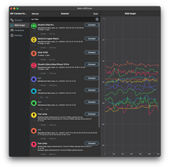
nRF Connect for iOS running on macOS via Project Catalyst 'checkbox'
When it was time to support macOS for nRF Connect, market realities dictated that it wasn't a priority. This meant Project Catalyst represented the fastest and easiest way for nRF Connect for iOS to come to the Mac. So as soon as we had the time, we did our best to ensure it at least runs on the Mac. When the M1 line of Macs launched, things took another turn, because Apple decided iOS apps can now run on the Mac without developer intervention, though it was possible to opt-out. All of a sudden crashes in our logs were showing up as 'iPads' that didn't exist, which turned out to be Macs. This allowed us to dedicate some time to fixing those issues because there was value for our customers. But as we discovered, "single click checkbox", Catalyst is not.
Look, nRF Connect is complicated, and we might've not made the best decisions from the start. We took some of it away, but there are a lot of decisions over there that have come back to bite us. It is common in the iOS realm for one to use custom Dialogs, and we did that for nRF Connect for iOS. And the consequence of this is that most of the Dialogs, when showing up on the Mac, look like they don't belong. In fact, we have a long-standing big issue on the Mac build of nRF Connect wherein you better not try to edit a Peripheral's Service, or you'll find out that our custom Dialog spans underneath the Peripheral's Modal. (Luckily, it appears this behavior does not apply to the current "run iOS Apps on the Mac" mode we've kept nRF Connect as.) The point being, that many iOS apps out there handle Alerts/Dialogs on their own, leading to this mish-mash wherein custom UIs designed to look good on iOS look out of place on the Mac. Kind of like in our previous example: just because you can lift a house and plant it in a different neighborhood, doesn't mean it's going to look like it belongs there without any extra work.
And the "Catalyst Checkbox" work doesn't end in UI issues. When we first added the Entitlement and enabled nRF Connect to run on the Mac, we were surprised the Scanner and the RSSI Graph worked without issues. But clicking around the app, and dragging a DFU ZIP file to be imported, revealed a crash. Our investigation revealed it was not in fact, the file import logic, but instead, on the UITableViewController. The same code worked on iOS, no issues. On the Mac, there were no build issues, so all the APIs in use were allowed and linked to by the compiler. Where was the problem, then? The UIDocumentInteractionController, despite what the documentation says, is not available on the Mac. So Beat It. But don't go, there's more. Earlier this year (2021), we noticed the memory gauge from within Xcode kept climbing when running nRF Connect on the Mac. We'd been dismissing it for a while, because we'd seen a similar thing on iOS and fixed it. But we decided to take a second look, and tracked the occurrence of the jump to when the scanning animation shows up. Again, this was fixed on iOS, and we tracked it to the SpriteKit Node not being stopped and de-allocating its resources. We replicated the calls that should be happening, and noticed, that some UIViewController calbacks we got in iOS did not get called on the Mac, so we had to install fallbacks in our code to keep the codepaths looking sensible without adding too many 'if Mac' branches. I think you get the idea.
The irony of it all? We've removed all uses of SpriteKit in the current work-in-progress next version of nRF Connect (2.6).
 |
|
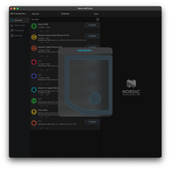
Left: nRF Connect for iOS 2.4.13 running on macOS, right: beta version of an upcoming release of nRF Connect for iOS, running on macOS
Despite this, and more, we reached a point where we started to feel comfortable with the idea of calling-through to AppKit APIs. For example, we got our error/notification dialogs to use AppKit's native Alerts, which look good. Even better, we are working on extending the 'native-ness' of nRF Connect on the Mac with an AppKit-based File Import Dialog, because the previous one was horrible.
Entering Stage Right: nRF Edge Impulse, and SwiftUI
This is where the promise of SwiftUI comes in. After our experience with Catalyst for nRF Connect, we decided to use the new nRF Edge Impulse project to test the waters of SwiftUI. The all-in-one framework allowed us to 'declare' how we want our UI to look and behave, rather than imperatively set everything up ourselves.
And, let's just say, what was promised was... not delivered.
 |
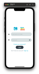 |
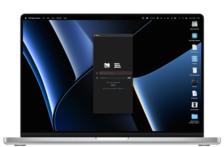
Left: nRF Edge Impulse Login View in Dark Mode (Mac), right: Login View under Light Mode (iOS)
Let's begin with a simple use case. Our first line of business when developing the new nRF Edge Impulse app was to get the user logged in. We can't begin to write a Server-based app without a system to store credentials and talk to the Server, including caching data such as tokens and API keys. And for the most part, development was quite smooth regarding this initial screen. It was daunting to begin with, because we had to learn multiple things: how to lay down the UI, how to persist data, how to connect to the Server and parse the JSON back, and where to safely store the user's API Key (hint!), how Combine works, and so on.
But soon, we ran into limits. For example: if you want the keyboard to prop up as soon as the login UI is visible to the user, you're in for some tough luck. There's no native API to set either the UITextField or the NSTextField as first responder. And here begins a new line of fixes and patches that are required to make SwiftUI apps behave more like native ones, so to speak. There are options: we can wrap UITextField/NSTextField as 'representables', which allow native UI elements to interact with SwiftUI, and it means double the work, and double the logic. We did not go this route; instead, we opted to start using Introspect, a framework that provides native access to the underlying UI component depending on the platform. And with Introspect, we were now able to set the username's text field as the first responder, prompting the onscreen keyboard to appear (iOS) and the field to be selected and waiting for input (macOS). This sets up the next thing we want to do, which is to change the Blue Button on iOS's keyboard so that the user can jump between the two fields, and then hit it once again to 'enter' and therefore attempt to login. And guess what? Before WWDC 2021 and iOS 15, there was no API to do this. In fact, we had #if checks in the code to allow this to apply only for iOS, which is another layer of code divergence between the two platforms. And yes, Apple did recognize setting focus was an area in which SwiftUI was lacking, so they added it. We can set it onAppear(), and we need more #if checks to make this code apply only for iOS 15 and newer, but that's okay. Except, Apple decided @available checks should be ignored, causing Xcode to emit lines of code for a platform that doesn't support it. Or at least, it should've been fixed from Xcode 13.2 onwards - we haven't checked.
This last part sums up our experience with SwiftUI. Modern SwiftUI Development is full of moments that make no sense. The @available-check Xcode bug caused us to have an immediate crash on the app when running on the Mac, and even under the tutelage of the LLDB debugger, we had no stack trace of the issue; it was a hard crash filled with lots of assembly and lines that we could not understand; after all, we're Swift developers, not linker wizards nor Swift demangling experts. Only starting the app without any UI, and then progressively adding-in pieces of code allowed us to track down the issue. Works on one device, but not on the other? The issue is almost always SwiftUI. And why is that? Because as a declarative framework, what SwiftUI means is that this DSL is interpreted to generate the appropriate backing native UI components (pick your poison: UIKit or AppKit). And each OS version, be it a patch, a point release or a major version, possibly means different behavior. We developers are famous for changing code that doesn't need to be changed. Proof is in the crashes our testers had on iOS 14.3 that could not be replicated after 14.5. The issue? SwiftUI bugs. What do you do, in this case? You need multiple UI declarations depending on what version you're running on. And this extends to basic things like modifiers: and here, Pickers are the biggest offenders. If you set a Picker with one style, it'll behave in some way, but not the other. In our case, one Picker style refused to update its UI when it changed, but not the other. File a radar you ask? Sure, we should be doing that. But at a certain point, these little cuts add up, and add up, to the point that it feels like SwiftUI is not being used by anyone. Like UIKit APIs that only work if you follow Apple's demos, or else they break.
It can be depressing because every time you release a new version of your app, you wonder what is going to be the next version-dependent if-check you're going to have to write to avoid issues. And once you've done it enough times, you wonder: why don't I just write this in UIKit and go the Catalyst way?
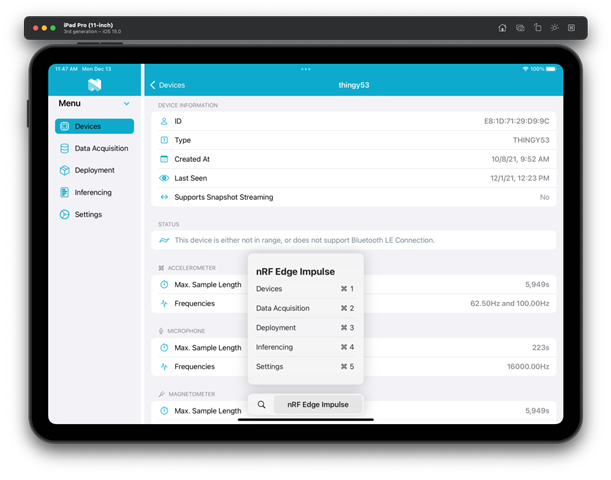
nRF Edge Impulse (dual-pane layout) running on an iPad Simulator
However, this is far from our biggest source of pain. We dealt with this throughout the first half of development for nRF Edge Impulse, so at that point, it felt like it was just part of the deal. But there were some things that we could just not believe were in place, and that nobody, from what we could tell, had pointed out yet.
In nRF Connect 2.x, from the start, we wanted to make a great iOS app, for all devices, iOS and iPad included. This meant we were very clear on the use of UISplitViewController from the beginning, so that we could make the UI react to how the user decided to size the app on their iPad. Besides, we had an inkling (and we were not wrong) that the same wide-spaced multiple-column design we applied to the iPad could be used when Macs were allowed to run on iOS. The proof was in other apps that went the long way around two native UI codebases, such as Agenda. And it's a paradigm that goes all the way back to the iPad's launch, and how North Star apps were then brought back to the Mac using AppKit: go wide, adding multiple columns and panes. Now on our particular case for nRF Connect using Catalyst, the UISplitViewController does the job. We feel the API is a bit finicky; for example, a hack is needed to properly set the percentage between the primary and secondary panes of your UI. Adding to that, UITabViewController doesn't like to be used to set its tabs vertically, like the Dock on the Mac. No; UITabViewController is only for iPhone tabs; if you want a column of tabs to switch between the two styles, you have to Do It Yourself. And added to that, the new triple-column style is, well, new, so it can only be used if you're targeting iOS 14 or newer, even though iOS 10 already had it. Conclusion? It was a lot of work to get the smooth behavior we have on the iPhone/iPad that now extends to the Mac for nRF Connect.
How does this look in nRF Edge Impulse, and specifically SwiftUI, you ask? The one framework to rule them all?
There is nothing. No native SwiftUI component to allow seamless switching between iPhone (single-pane), iPad (single, dual and triple-pane as needed) and Mac (triple-pane, usually) layouts. Let me repeat that: there is no root View Container, á la UISplitViewController on iOS, to help you out in switching between layouts for your top-level View. There is NavigationView, but you can't use one and force it to behave like you want for every scenario. You can't, for example, force a DoubleColumnNavigationStyle to always have its Sidebar extended on an iPad in Portrait mode, unless you bend its arm via Introspect, destroying the idea of sharing this layout logic between iOS and macOS. And this is on the third year of SwiftUI, when they're taking care of seemingly less important things like Pull to Refresh, Markdown support and the aforementioned fixes to allow for Focus / Keyboard management. How this has not been pointed out by the wider Apple community, we don't know.
This is how we took care of it:
struct RootView: View {

    // MARK: Properties

    #if os(iOS)
    @Environment(\.horizontalSizeClass) var horizontalSizeClass
    #endif

    // MARK: View

    var body: some View {
        layout.view()
    }
}

// MARK: - Layout

extension RootView {

    var layout: Layout {
        #if os(OSX)
        return .threePane
        #else
        if horizontalSizeClass == .compact {
            return .tabs
        }
        return .dualPane
        #endif
    }

    enum Layout {
        case tabs
        case dualPane
        case threePane

        @ViewBuilder
        func view() -> some View {
            switch self {
            case .tabs:
                TabBarLayoutView()
            case .dualPane:
                TwoPaneLayoutView()
            case .threePane:
                ThreePaneLayoutView()
            }
        }
    }
}
It doesn't end there.
Using the native TabView component does not give you native iOS behavior, like double-tapping on the Tab for the Navigation stack to be popped to its root. If you want to do that, you've got to write the code on your own.
If you want the user to be able to deselect their selected pane (in double-pane our triple-pane layout) by tapping/clicking on it, tough luck: it's not a part of NavigationLink. If you want this to happen, you need to 'hack it', by using a Button to set a nullable (née Optional) Binding, and then switching over its value in your View to show your View or the other:
// MARK: HorizontalTabView

struct HorizontalTabView: View {

    let tab: Tabs
    @EnvironmentObject var appData: AppData

    var body: some View {
        Button(action: {
            guard appData.selectedTab != tab else {
                appData.selectedTab = nil
                return
            }
            appData.selectedTab = tab
        }, label: {
            Label(tab.description, systemImage: tab.systemImageName)
                .frame(maxWidth: .infinity, alignment: .leading)
        })
        .accentColor(appData.selectedTab != tab ? Assets.blue.color : Color.white)
        .background(appData.selectedTab == tab ? Assets.blue.color : Color.clear)
        .cornerRadius(8)
    }
}

// MARK: Layout

struct TwoPaneLayoutView: View {

    @EnvironmentObject var appData: AppData

    var body: some View {
        HStack {
            NavigationView {
                List {
                    Section(header: Text("Menu")) {
                        ForEach(Tabs.availableCases) { tab in
                            HorizontalTabView(tab: tab)
                                .withoutListRowInsets()
                        }
                    }
                    .accentColor(Assets.blue.color)
                    .padding(.top)
                }
                .listStyle(SidebarListStyle())
                .toolbarPrincipalImage(Image("Nordic"))
                .setTitle("nRF Edge Impulse")
            }
            .setupNavBarBackground()
            .setSingleColumnNavigationViewStyle()
            .frame(width: 215, alignment: .leading)

            // Don't use appData.selectedTab?.view because SwiftUI will not switch well within them
            // if there's a DetailView pushed into the embedded NavigationView.
            VStack {
                switch appData.selectedTab {
                // TODO: Add View for each Tab here.
                default:
                    AppHeaderView(.template)
                        .setAsDetailView(title: nil)
                }
            }
            .frame(maxWidth: .infinity, maxHeight: .infinity)
        }
    }
}
We could keep going on forever. Going from the 'idea' of what you deem possible to turning it into a stable proposition in SwiftUI reminds us a lot of earlier days in the UIKit world: either Apple Developers have thought of exactly your use case (which means it's going to be a 'fire-and-forget' solution) or, you've got to roll your sleeves and get your hands dirty.
Now, this is not to say SwiftUi doesn't have its own advantages. It does have situations in which it makes your life so sweet, you wonder how you could ever go back to the frameworks that came before it.
import SwiftUI

struct ContentView: View {

    @EnvironmentObject var appData: AppData
    @EnvironmentObject var deviceData: DeviceData

    var body: some View {
        if appData.token != nil {
            LoggedInRootView()
                .environmentObject(deviceData)
        } else {
            NativeLoginView()
        }
    }
}
Our topmost View, our ContentView, switches between our 'login view' and the 'logged-in' view with just that. And it works on the Mac as well.
If we were to go back to UIKit-land, it would require a root UIViewController of some sort that's listening to the state of the app, to detect changes on the app's logged-in status (in nRF Connect, we do this using Notifications). In any case, we'd be listening to this property, and having a couple of functions here and there handling the logic of switching the UI if we detect our API Token exists, or if it has been cleared out (on logout, we set the token to nil). But with SwiftUI, for this project, that was all the work needed. We wrote it early on in development, and we haven't had the need to touch it since, which is a testament to SwiftUI's reliability in this case. No memory leaks, View issues, or anything of that sort. Though those have been present, they've been due to our big tree of views for the logged-in case. But that's it.
Takeaways
If you've just opened this link, and scrolled all the way down here, what you're going to read is pretty predictable: when SwiftUI works, it's like magic. When it does not, you wonder why you're even using it in the first place. But we have more specific bullet points that you can walk away with:
- Navigation is a pain in SwiftUI.
For this reason alone, we recommend starting UIKit/AppKit projects and using 'traditional' imperative programming to control your state and your navigation. This does not mean that you can't have it all in SwiftUI-land and wrapUIViewController(s) andNSViewController(s) as SwiftUI views and handling navigation from there; it could also be that you're willing to fight against the hacks required to bend SwiftUI Navigation to your wishes, or that you're fine with what SwiftUI offers as it is. At this point in time (2021), we don't think it's worth it. But that might also just be us and our refusal to join the Church of Point-Fresco (don't worry - in our case it's temporary). - SwiftUI on the Mac is undercooked.
It does work, but there is a layer of 'free work' that was given to iOS that was not provided for the Mac. And it's not just missing APIs that exist on one side and not the other, but the fact that SwiftUI layouts, out of the box, look at home when running on iOS, but not on the Mac. To make a SwiftUI look like it belongs on the Mac, you need to sweat the details. And this is done either by customizing the layout of Views for the Mac target, wrapping AppKit components inNSViewRepresentable(s) so they can be used from SwiftUI or any other way that you can think of. It's possible, and we're grateful that, to some extent, the level of logic-sharing that can be performed between the two is 90-95% there. But that last 5% is in details that are needed to be placed on the Mac side so that it doesn't look ridiculous. And to know what is missing, you need to love the Mac in the first place, which is another problem Apple could've solved with SwiftUI on the Mac, as it does for iOS. - Just like UIKit and AppKit before it, SwiftUI has its own rules to follow.
For example, you would not modify the state of aUISwitchor disable aUIButtonfrom a background thread. Or if possible, you'd use a CADisplayLink over a Timer to perform work that is visible to the user. There are some things we all know to do (or not to do) once we've spent enough time with these older frameworks, and the same thing applies to SwiftUI. As magical as Apple wants us to believe it is, it has its own do's and don'ts. The main thing is to always remember the View Identity Tree: it is tempting to add modifiers and functions that return different views because Apple themselves has repeatedly said that Views are cheap to make. But what you should strive to do is always return the same one, but modify it, instead of switching between multipleViewvalues. There are exceptions as we have ourselves shared above, but if you find yourself wondering why SwiftUI's layouts or modifiers/conditions are suddenly breaking, chances are you broke the Identity tree. And no, we don't mean theIdentifiableprotocol that is critical to SwiftUI. If this bullet point sounds foreign to you, we encourage you to spend the time to dive deeper into it. Trust us. Oh! And one more before we forget: the order of modifiers on your views matters. Be careful where you declare those Context Menus! - Brace yourself for doing your own work regarding Alerts/Dialogs.
If you follow the Internet's advice and roll-your-own, it'll look at home on macOS since it's easy to get SwiftUI to render them like a native Window above your existing content, but on iOS it just looks like what you're going to do: aZStackwith layered views and an intermediate darkeningView. Not that for iOS we haven't done the same throughout the years, but on iOS an Alert can be extended with your own views. In fact, if you need to make Alerts on your SwiftUI app, we recommend going the painful route of wrapping your customUIAlertViewas a SwiftUI view and then managing the macOS side of the fence. However, you decide. In the end, it looks better and makes your SwiftUI app feel and look native under iOS. - Not to sound like haters, but working with SwiftUI entails random crashes that cannot be explained.
In the Inference Screen of nRF Edge Impulse, on previous versions of iOS, the app would crash if you scrolled past the visible height of its parentView. And this was not due to malformed data or some combined piece of logic. No; it was due to our old friendUITableViewcomplaining about Sections and invalid numbers of rows. Yes, I'm afraid we're never going to get rid of that, even after the debut of the DiffableDataSource API.
On an additional note, we'd like to point out that we're far from being the only ones to have contested the rainbow-magical view of SwiftUI. And you can find multiple examples in our community of everyone coming to terms with how half-baked this big chunk of our favorite platform is. There are the folks at PSPDFKit; the trio of Marco, Casey and John; Christian Sellig, developer of the Apollo App client for Reddit asking for help over on Twitter; and of course, the wizard that is Steve Troughton-Smith.
About WWDC 2022*...
They fixed some very important things, but as they're currently in beta and unreleased, we haven't been able to embrace them yet. Though we can enumerate a few that relate to some of the issues we encountered and, please excuse us if there are things we've missed - it's all just too new to tell yet:
- (* Since iOS 15, as pointed out earlier) We no longer need Introspect to set the focus of a View as First Responder.
- Our navigation prayers were answered in the form of the new NavigationSplitView. From what we could tell, this seems like the sort of component that was needed from day one. Now as always with new APIs, it's difficult to tell until you use it, so we're going to give them the benefit of the doubt. After all, even
NavigationLinkis being rethought in the form of the new NavigationStack for better developer control. - Opening a new 'Window' (
UIScene) is as easy as it should've been from day one. - Async / Await was a major win that will probably take years to fully be adopted and understood by everyone, kind of like Grand Central Dispatch, which itself debuted all the way back in 2009. That being said, clearly Apple wasn't using it much with SwiftUI, because only now have they properly connected both via the new .task() modifier.
- On the Mac, SwiftUI now layouts
View(s) to better reflect the design language of the Mac, and not iOS. This is most likely a consequence of the new System Preference(s) App for macOS Ventura which has been done in SwiftUI, since previously, we had to make Settings panel(s) behave like they belong on the Mac ourselves. - And let's not forget, that it has taken until this Late Summer / Fall Xcode's 14 Release, for SwiftUI to have always-on automatic SwiftUI Previews!
Perhaps the most important development of this year's WWDC is the clear message that SwiftUI, is the way. This means Apple's focus will remain on SwiftUI, and the day will come when new APIs are only available through that framework, and not through UIKit or AppKit. A clear signal of where to steer our ships.
The Future
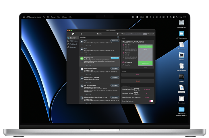
(Note how much of this is an in-development Preview of nRF Connect 2.6 running on the Mac that there's a SwiftUI bug on the lower-right corner...)
Despite all of SwiftUI's issues, we thought the writing was on the wall for all the other avenues of multi-platform development. It wasn't transparent but, with Apple's intent on favoring the Mac more, especially given their hardware investments on it, investing in SwiftUI makes sense. If they can get it to work, their existing developer base will be able to adopt most of their platforms with a lower barrier of entry. And don't get us wrong, SwiftUI is capable of some great things. You can see another sneak peak of what we're (slowly) working on for the next version of nRF Connect, and that new DFU screen complete with the Package Layout Preview is all SwiftUI. The new SwiftUI Charts framework is something we can't wait to get our hands on. It's unmistakable that SwiftUI holds a lot of potential underneath it, and it is unparalleled when it comes to fast UI prototyping (if you can get automatic Previews to not throw random errors and work as intended). We all have our own AutoLayout prayers to do when it comes to figuring out the size of text or getting UITableView to properly self-size our cells, but with SwiftUI, it almost feels like we might be turning a big corner.
Only time will tell.
nRF Edge Impulse is now open-source. Code is available here.

