Hi,
There is another thread with this exact question, but I don't understand the answer, and the thread is locked.
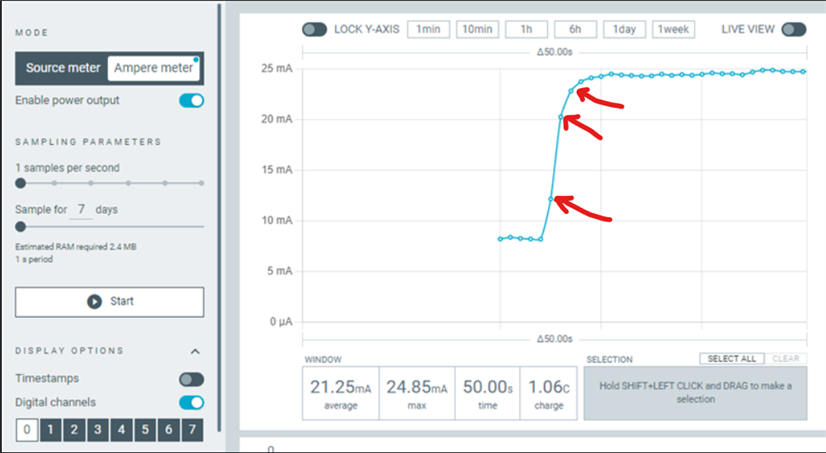
This is the PPK2 measuring at 1 sample per second.
I start up a high-consumption device, which starts basically instantly, and the graph shows multiple seconds of gradual increase. You can see the individual data points, which should correspond to 1 data point per second.
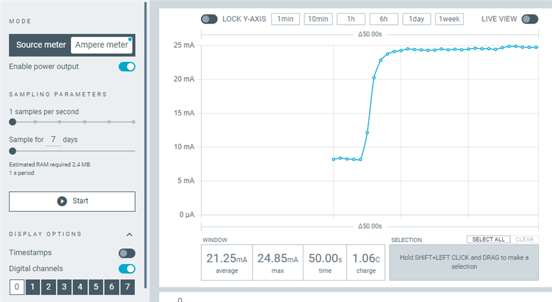
Here is another shot, sampling at 10 samples per second, of the same event. Now I can see 6 samples leading to peak consumption, which corresponds to 600ms, far less duration than the 1-sample-per-second graph above, for the same event.
This makes me believe the PPK is doing some rolling window averaging of values. Is that how it works?
I know the device is capable of doing 100,000 samples/sec. Does it do that all the time regardless of configuration, and feed that data into a rolling average?
How wide is the window of the rolling average? Does it depend on the configuration settings?
And is that window centered on the data point to be drawn? For example, in the first graph, it took multiple seconds of wall clock time for the graph to finally reach its peak value, despite the actual electronics changing consumption nearly instantly. Makes me think there is a multi-second-wide window which is waiting for future data to arrive to calculate "now's" value.
Please if you can explain how this works. Please let me know if my comments and terminology don't make sense I can try to be clearer.
If there is a technical document describing the implementation that would be helpful too of course.
Thanks.